AI Art Platform
Building a scalable design system
for an AI image-generation platform
Role: Interaction / Product Designer — design system owner
Team: Two designers (one
from the client) + a development team, working in Agile sprints, working
directly with the client
Timeframe: 2023
Platform: Web — an AI image-generation platform (Stable Diffusion / LoRA)
OVERVIEW
This was a real client product: a web platform where people generate, upload, and share AI created images. The product covered the full journey, sign-up, generating images, uploading and downloading them, and the social layer around them (blogs, likes, comments, blocking). Working from the Hybrid Teams side alongside a designer from the client, I owned the product’s design system, a shared component library the whole team built from across a series of Agile sprints.
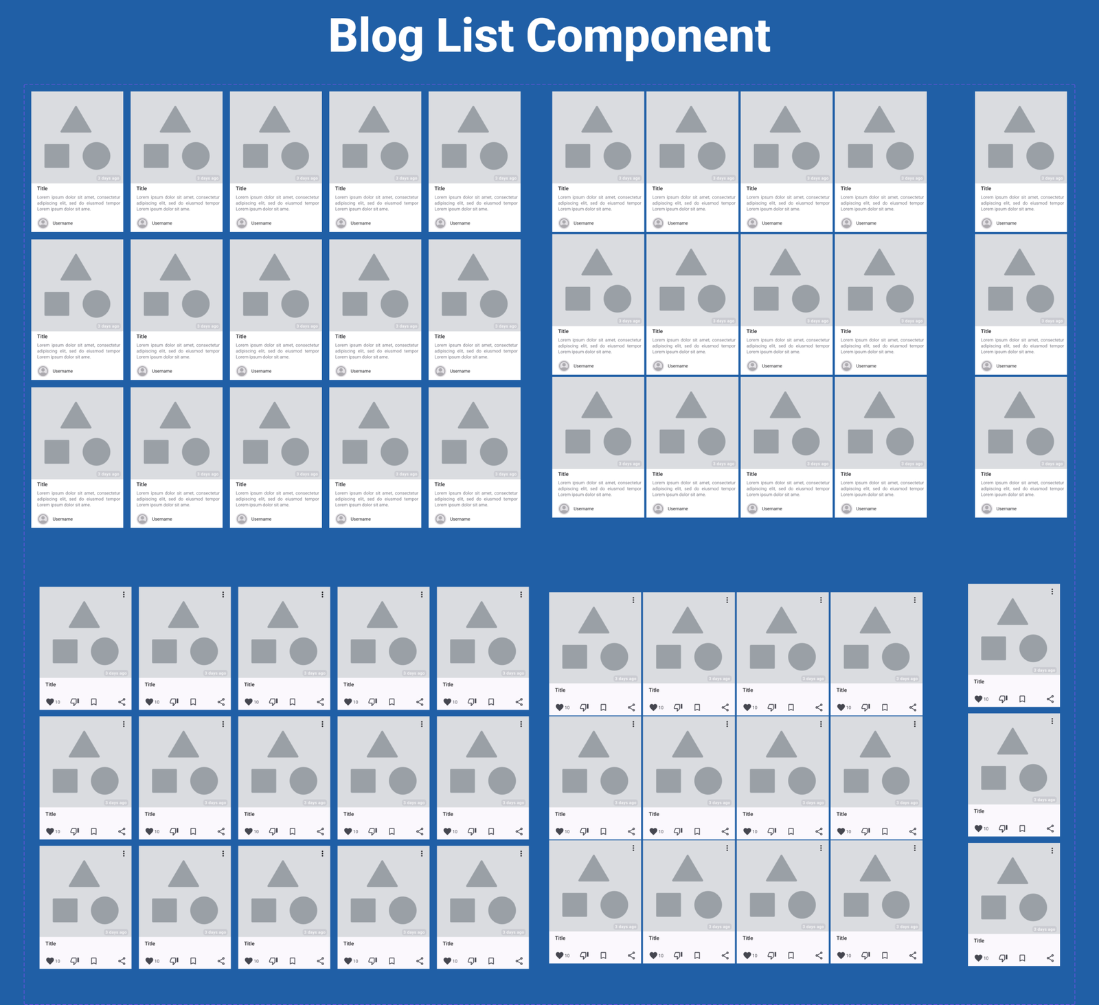
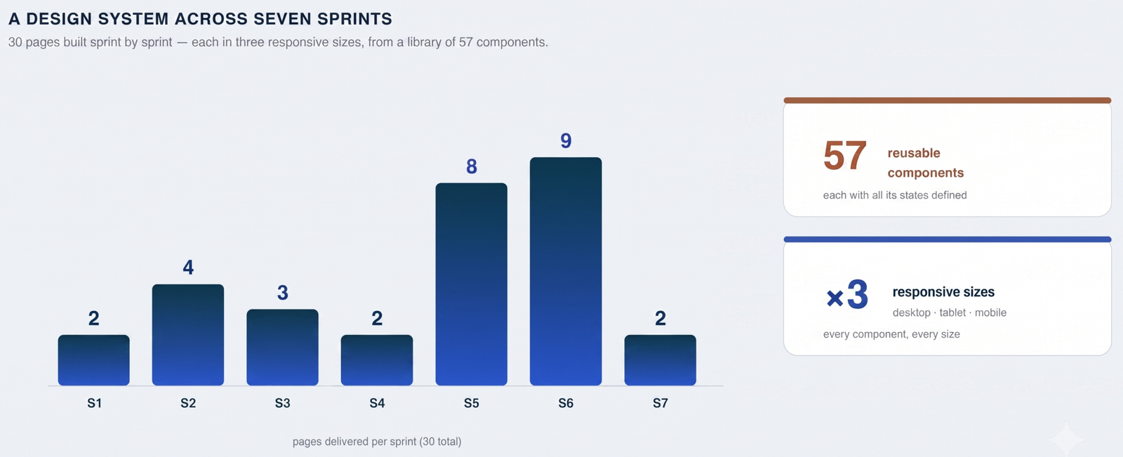
Unlike a flow-heavy product, the user journeys here were fairly routine. The real challenge was scale and consistency: across 7 sprints I delivered 30 pages built from a library of 57 reusable components, each with its full set of states, and each designed responsively for desktop, tablet, and mobile. So my focus went where it mattered most: into the components and the system behind them.
My role
I worked from the Hybrid Teams side with a designer from the client, in an Agile setup organised around sprints (Sprint 01–07). My focus was the design system:
- I owned the component library end to end. building and maintaining a shared team library the whole team designed and built from.
- The client designer contributed and reviewed. decisions were collaborative and the system stayed open to change.
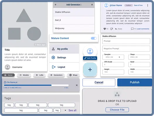
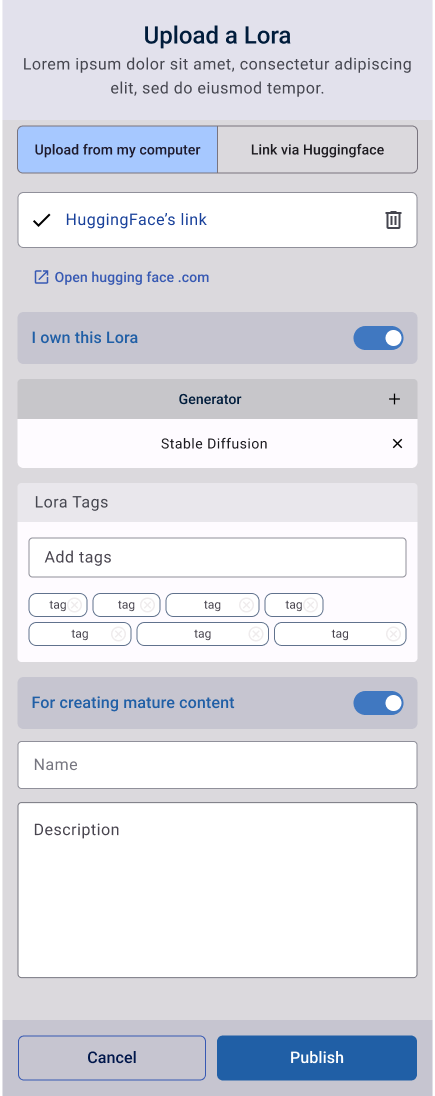
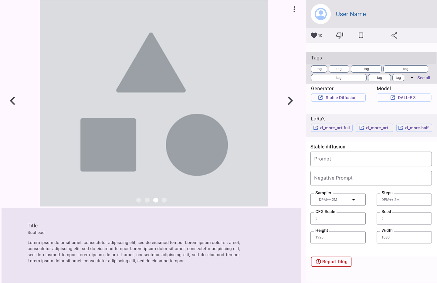
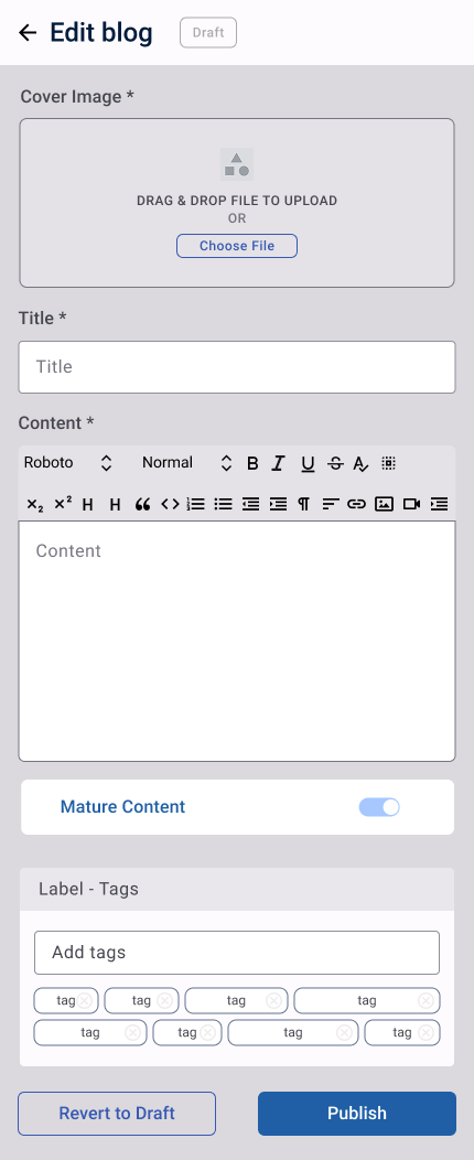
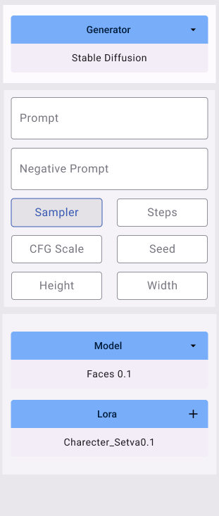
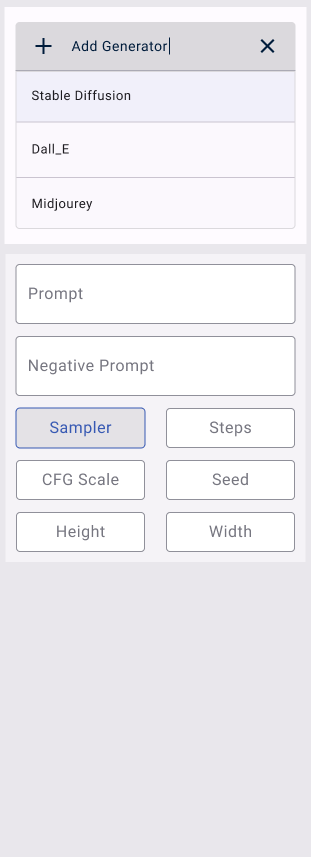
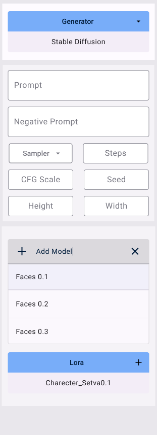
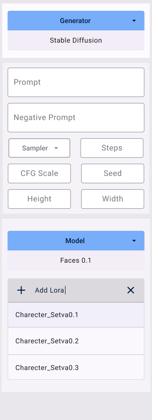
- I designed components across sprints. Upload, Comment, Blog, LoRA Preview, Artwork Options, Profile, and more, each as a reusable, consistent building block.
- I designed everything responsively. every component and page across three sizes (desktop, tablet, mobile).
- I worked closely with developers. so components handed off cleanly and matched the intended behaviour.
The challenge
The product had a lot of moving parts — image cards, upload flows, comments, blogs, profiles, generator settings, spread across many pages and repeated everywhere. Without a system, that kind of surface area drifts fast: inconsistent components, mismatched states, and a build that’s hard to keep coherent.
The challenge wasn’t a complex user journey; it was building a design system that could scale with the product and stay consistent as new features arrived sprint after sprint.
My approach
Designing in components, not screens. Because journeys were routine but surface area was large, I built the product as a library of reusable components rather than one-off screens, so every page drew from the same consistent parts.
Defining every state up front. For structured categorisation and filtering to work later, each component needed all its states defined from the start, not just the default. So I designed the full set: default, loading, selected, warning, error, and empty, per component.
Working in Agile sprints. The library grew sprint by sprint (Sprint 01–07). Each sprint added or refined components, and I kept the system coherent as new features landed.
Handing off cleanly to developers. Components were built to be unambiguous for engineering, so the build matched the design and the system stayed consistent in production.
Scale
The numbers give a sense of the surface area I kept coherent:
- 7 sprints of iterative delivery
- 30 pages, built from a shared library
- 57 reusable components, each with its full set of states
- × 3 responsive sizes, desktop, tablet, and mobile, for every component
Keeping a system this size consistent, as new pages and content types arrived sprint after sprint, across three breakpoints, was the core of the work.
Highlighted decision — designing every state, including safety
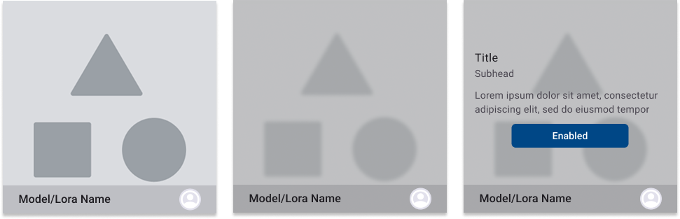
Because the platform hosts user-generated AI images, one state mattered more than the rest: mature content.
I designed the image card so that mature content is shown blurred, with a clear warning, rather than hidden or removed. This protected users from unexpectedly seeing sensitive content, while making sure an image was never accidentally taken out of reach, it stayed accessible behind a deliberate, informed action.
It’s a small decision, but it shows how I approached the whole system: not just designing the happy path, but defining how every component should behave in the situations that actually matter, including the sensitive ones.
Outcome
I delivered a coherent, reusable component library that gave the product a consistent foundation to grow on, one system behind many pages and content types, built to scale as new features arrived.
The product was in active development during my time on it; I’ve focused this case on the design-system work itself rather than a launch outcome.
My recent work
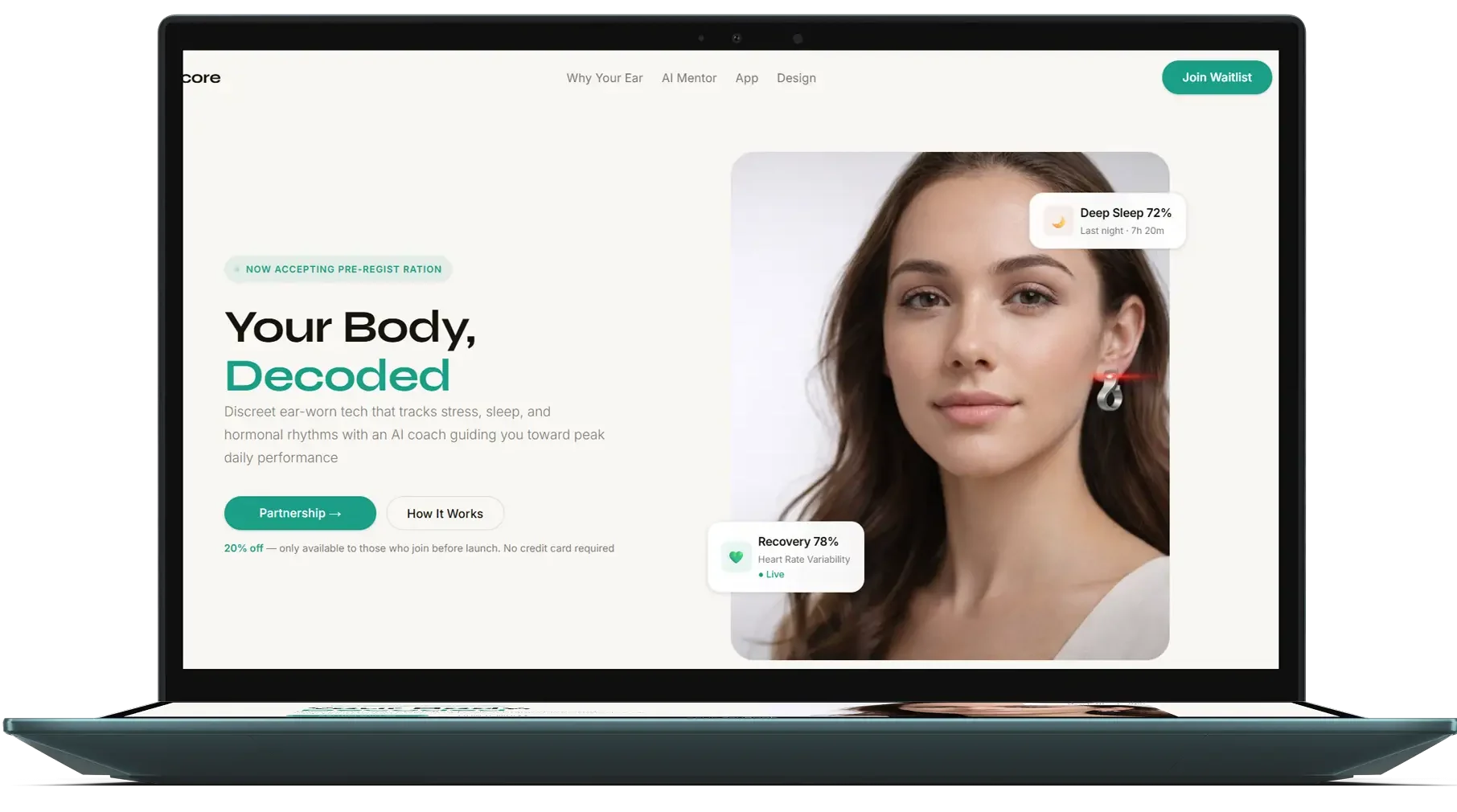
Auricore
Leading discovery research for an ear-worn health wearable.

YUV
Designing the digital experience for a smart hair-colour system.

Hybrid Teams
Positioning a startup with audience research.