Brand & Visual Design
Identity work, from a full guideline system to marks built around a single idea. I design identities as systems rather than single logos: a form that carries an idea, and the rules and patterns that let other people apply it correctly without me in the room.
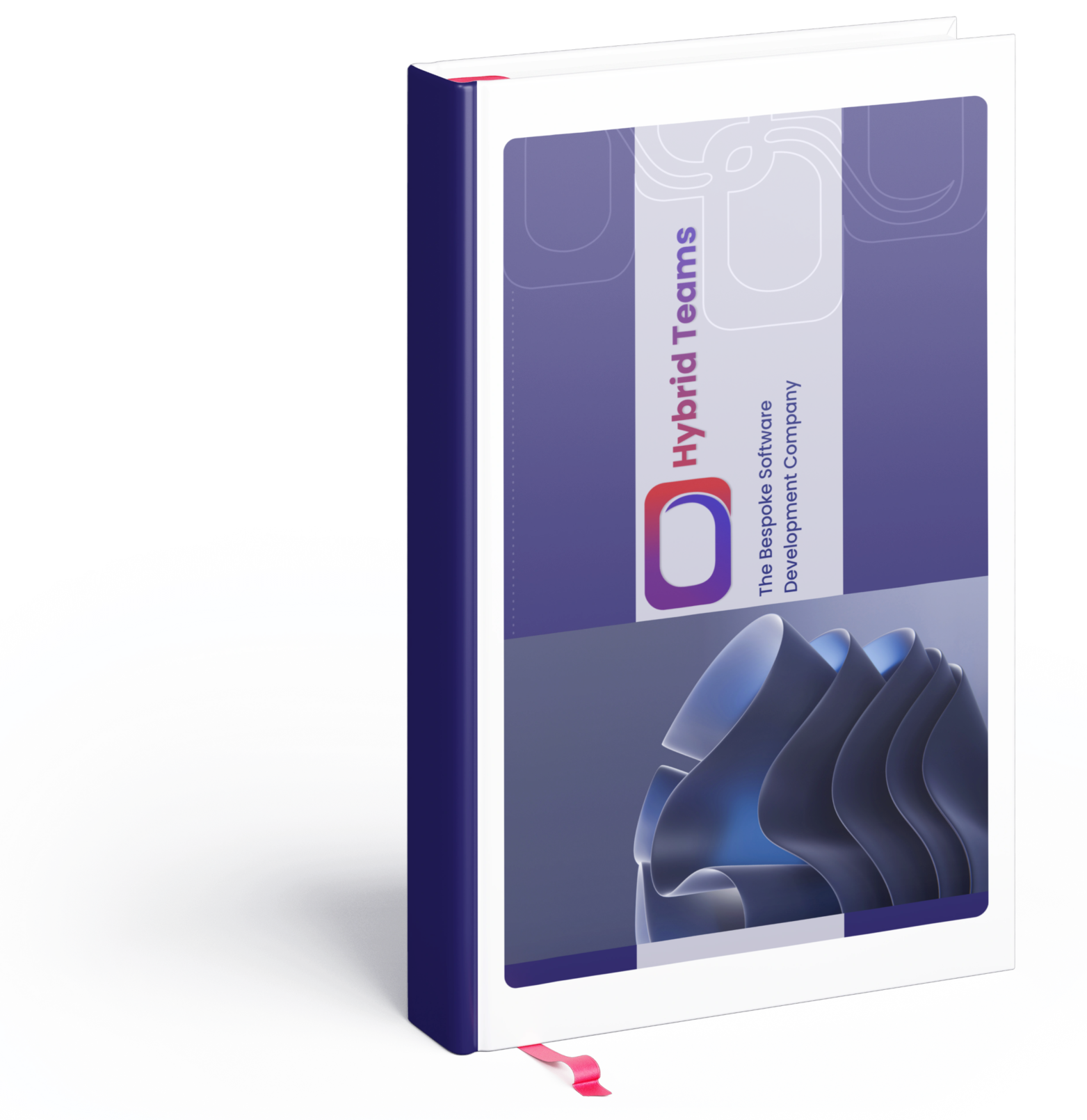
Hybrid Teams — brand identity & guidelines
Full brand system · 2021–2024
I built the complete brand identity for Hybrid Teams, a multinational software company, and documented it as a single guide the whole team could work from.
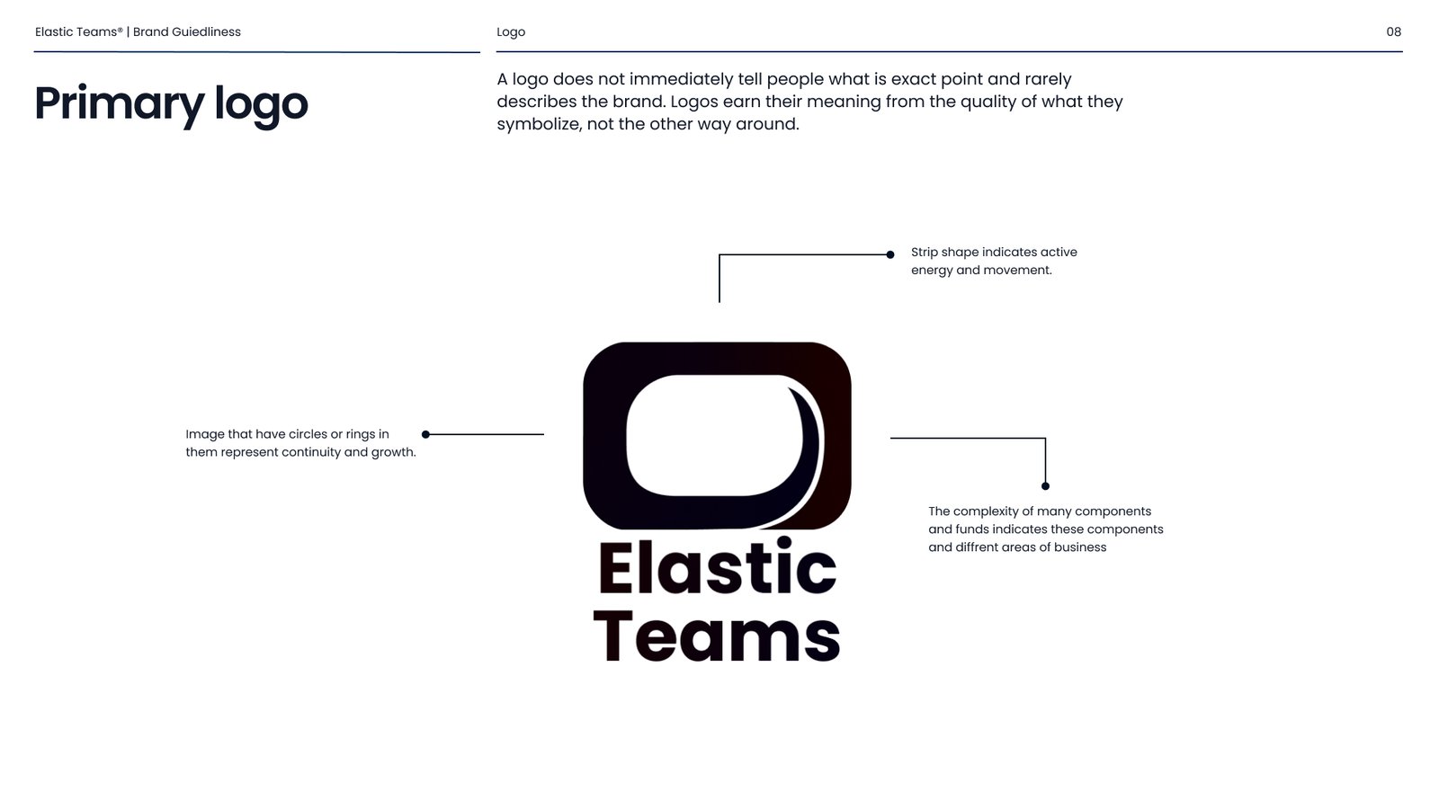
The logomark is drawn from a Möbius strip, one continuous surface with no beginning or end. The looping form carries movement and energy, the enclosed ring stands for continuity and growth, and the overlapping components reflect the different areas of the business.
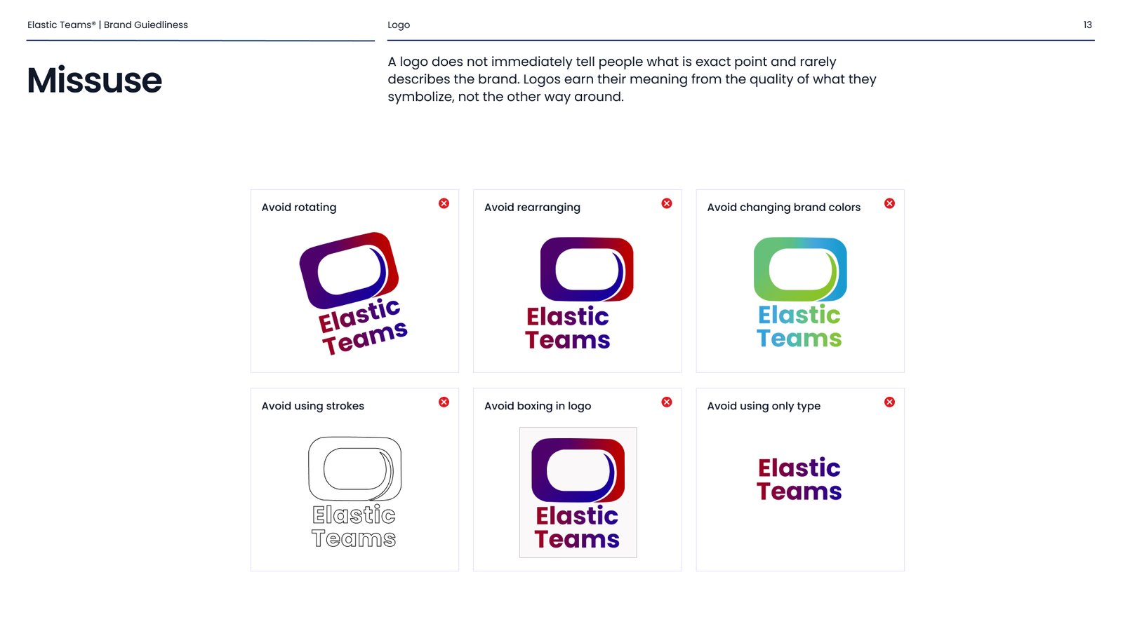
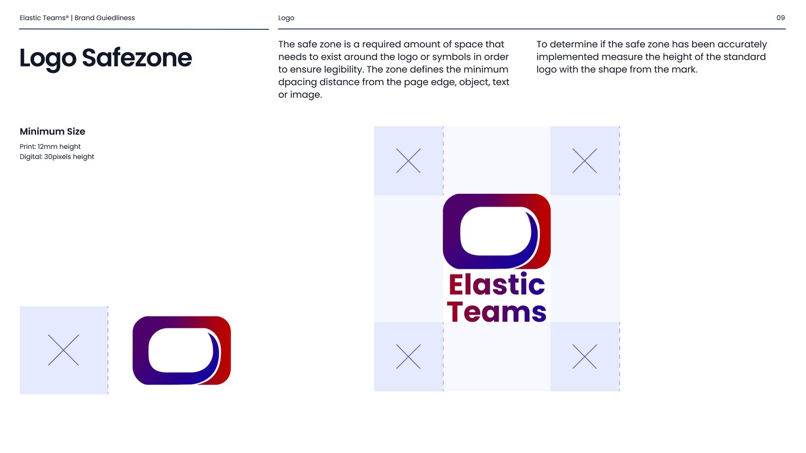
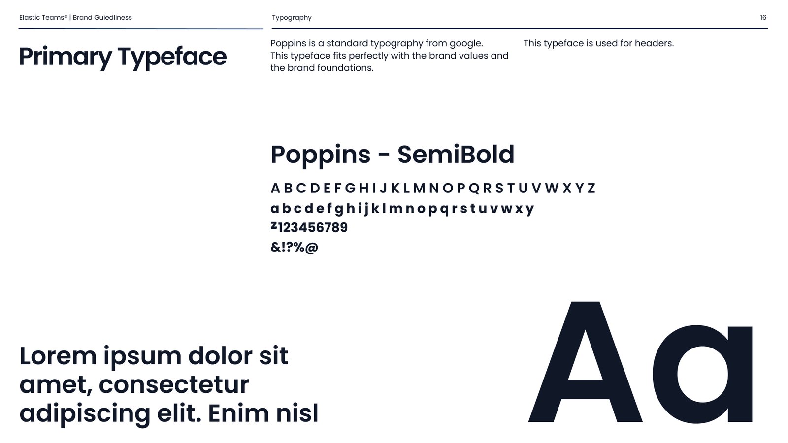
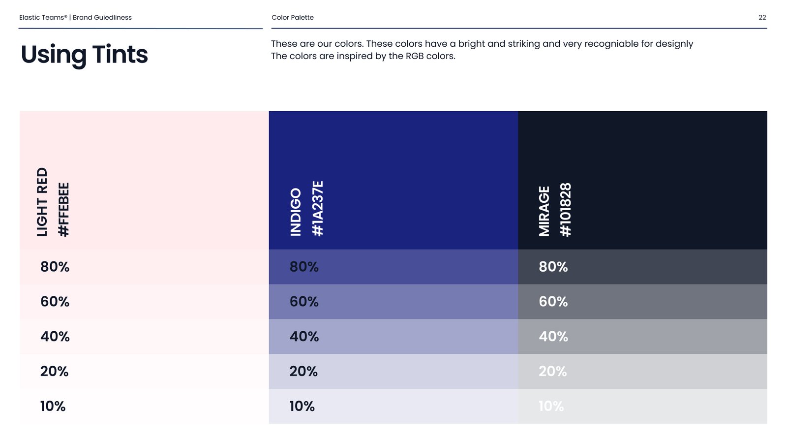
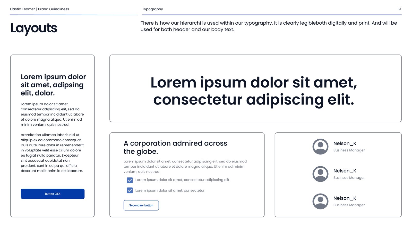
The system around it covers the logo and its construction, safe zones and misuse rules, a typographic hierarchy, a colour palette with tints, and a graphic language of icons, patterns and photography direction.
What mattered most wasn’t the mark itself, it was making the rules clear enough that other people could apply them correctly without me in the room. That’s the same instinct I later brought to design systems in product work.
Carousel Solutions Group — logo design
Identity mark . 2026
Carousel Solutions Group is the parent company of Hybrid Teams, whose identity I had designed earlier, a mark drawn from a Möbius strip, where one continuous surface stands for continuity and growth.
The group’s existing logo was dated and had no relationship to that identity at all. The brief was to bring the parent mark into the same world without simply copying it.
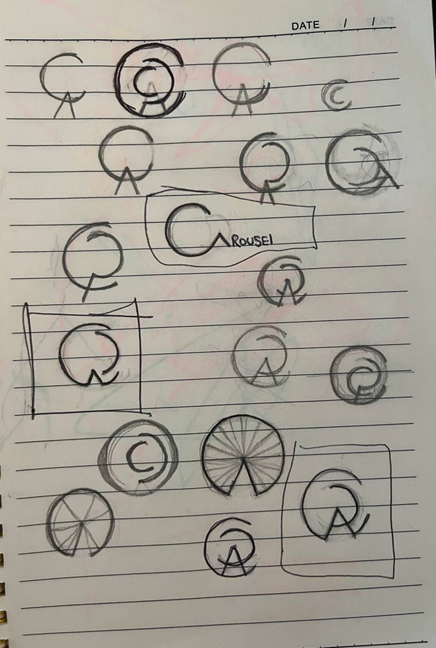
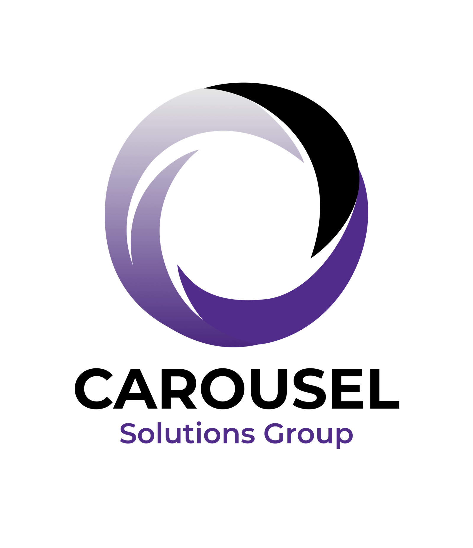
I started with letterform routes, working through variations of a C and A monogram. The sketches kept circling back to rotation, and that’s where it settled: rather than spelling the name, the mark could behave like it. The final logo is four curved blades turning around a centreو a carousel in motion, built from overlapping arcs that still read as a single circle at small sizes.
It shares its underlying idea with Hybrid Teams: one continuous form, no beginning or end. The group specified the palette; the form was mine.
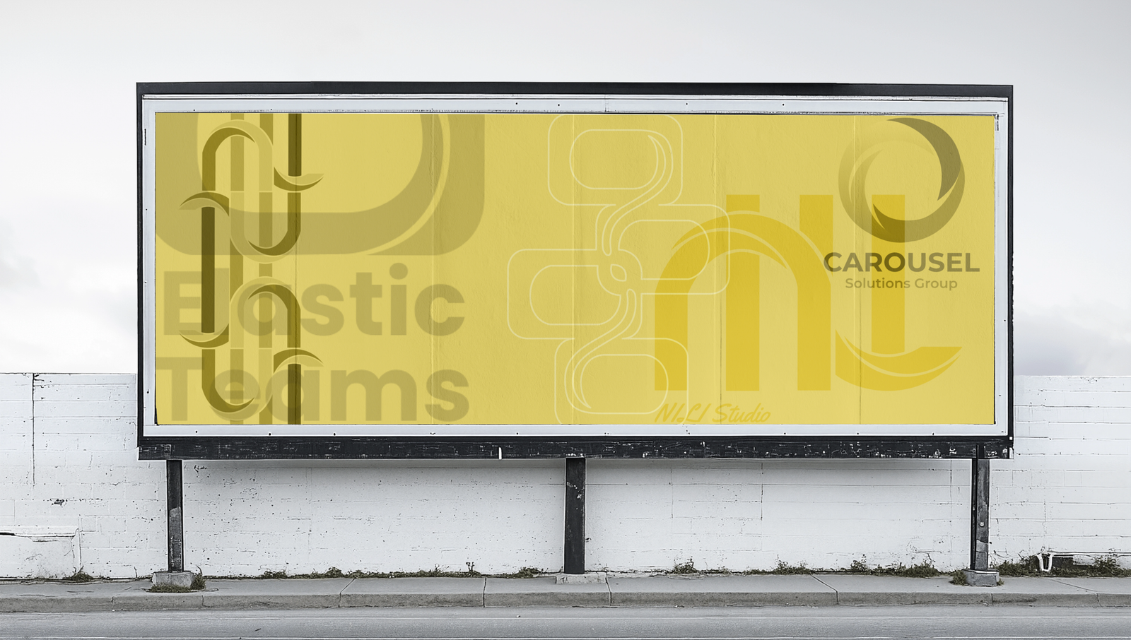
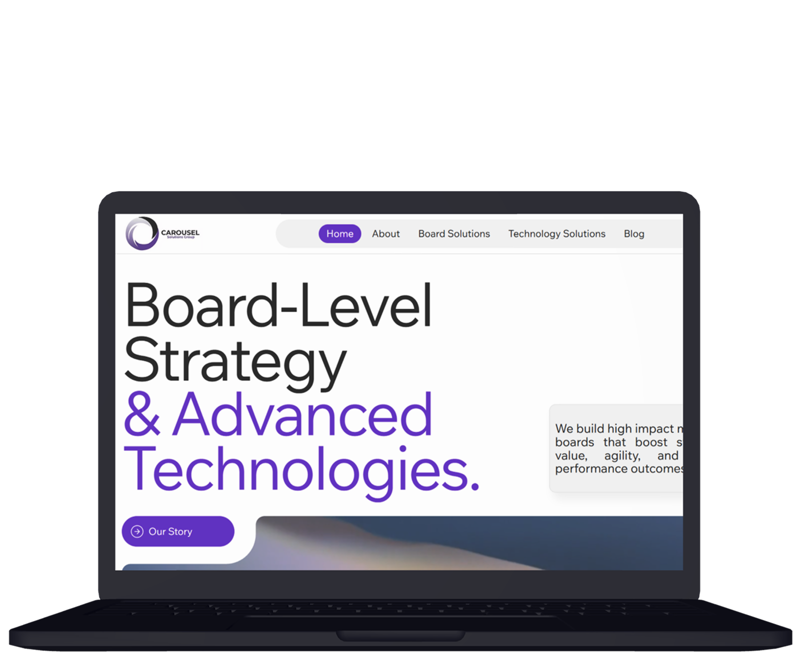
The mark is now in use across the group’s website and materials.
Nili Studio — brand built end to end
Identity, art direction & digital Personal studio · 2026–Present
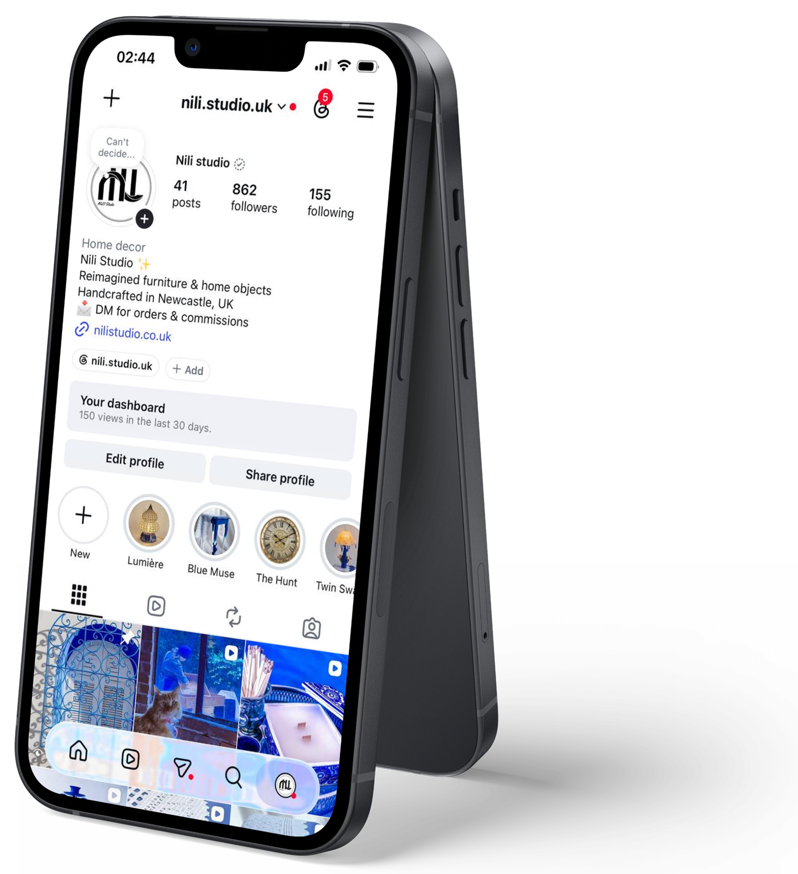
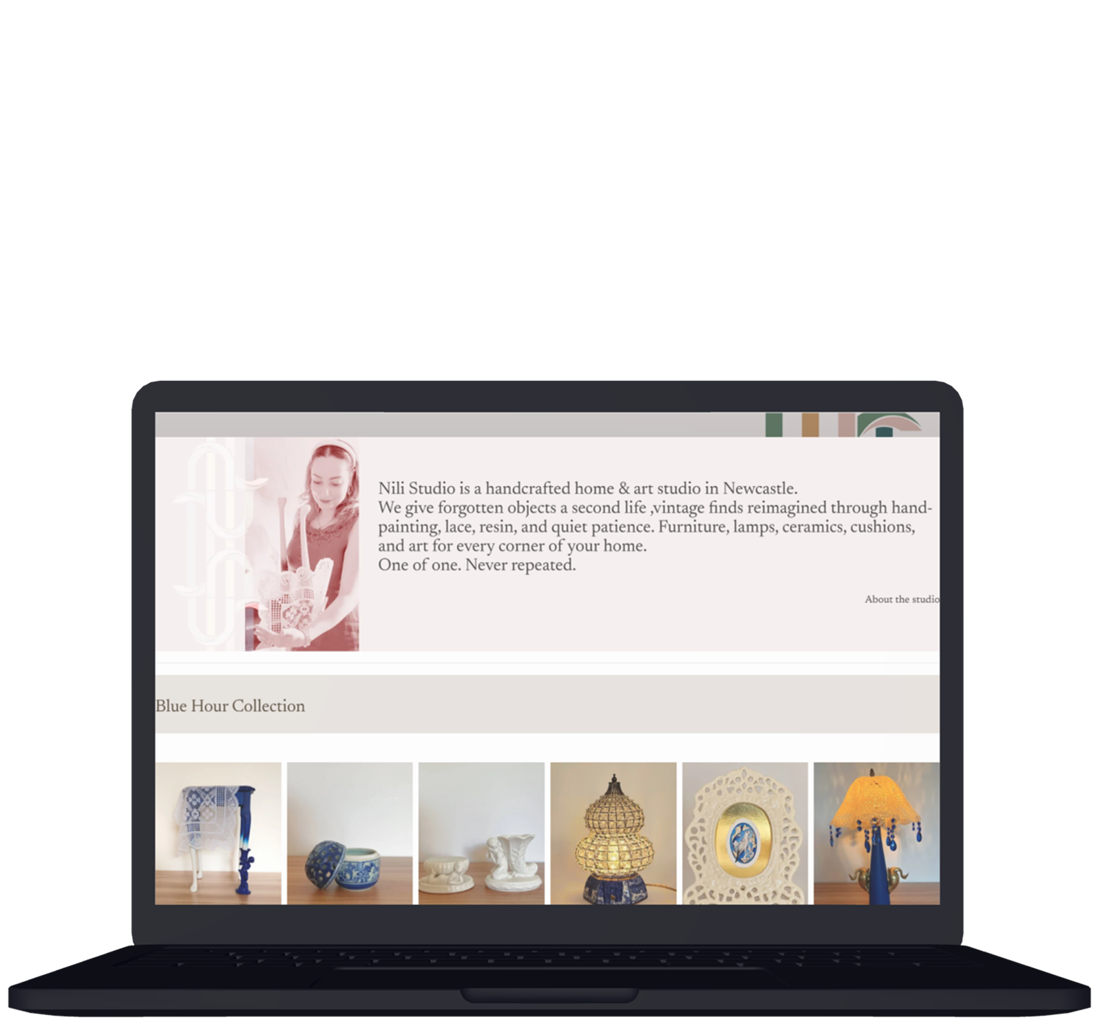
Nili Studio is my handcrafted home and art studio, giving vintage pieces a second life through hand-painting, lace and resin.
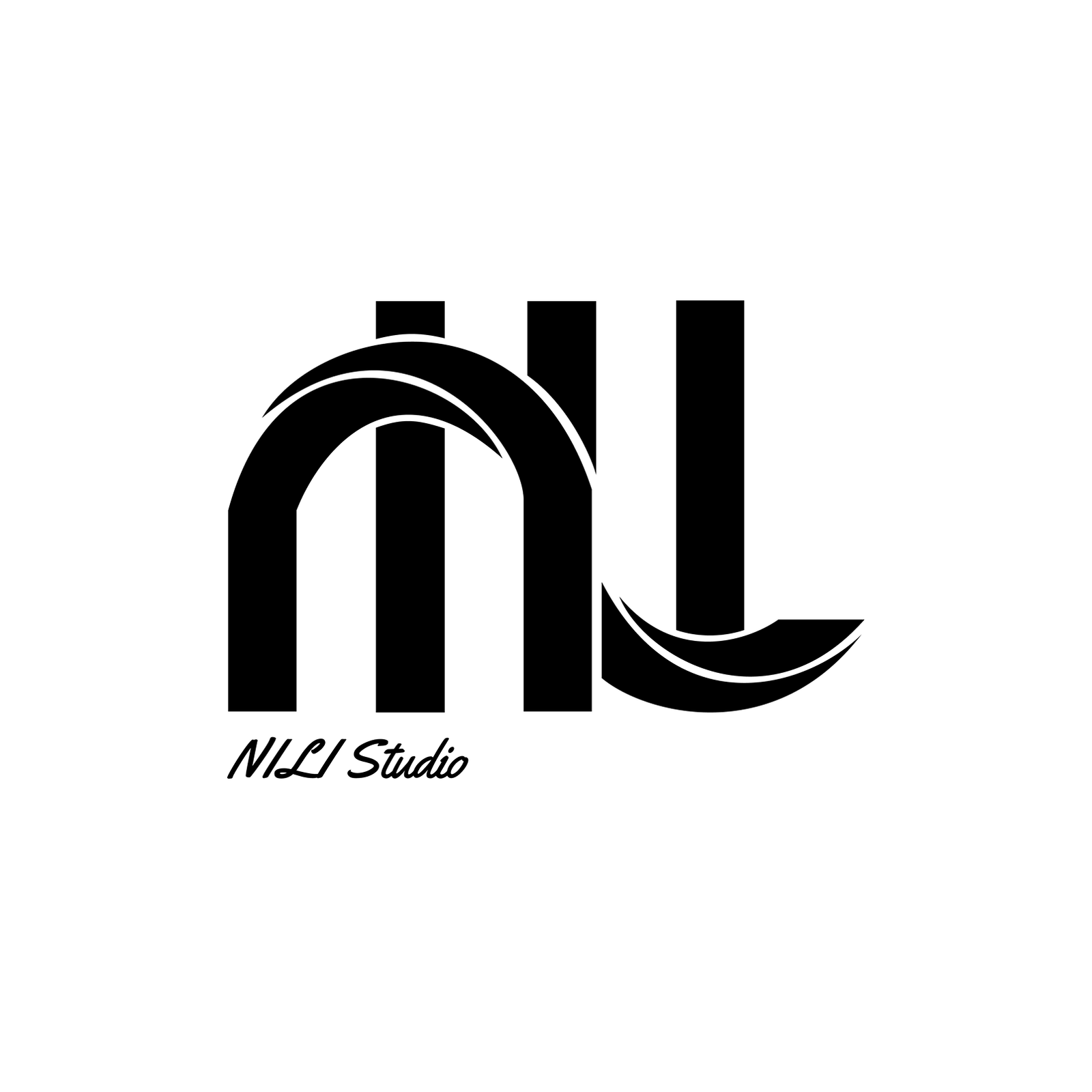
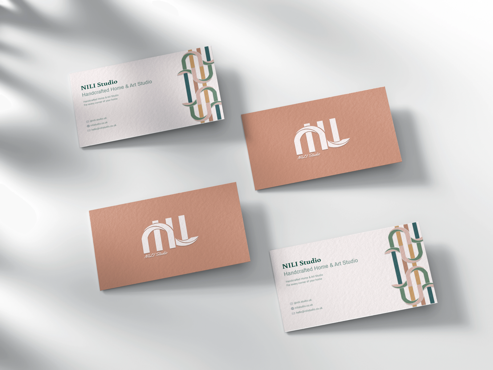
The logo is the word itself, A typographic mark where the letterforms of NILI carry the curve of furniture: the sweep of a chair back, the turn of a leg. From that mark I derived the brand’s pattern, repeating and interlacing the same forms into a woven ribbon that runs across stationery, packaging and the shop.
The palette is deliberately earthy, terracotta, deep green, teal and ochre so the brand sits with the objects rather than competing with them.
I built every part of it: identity and naming, the pattern system, print stationery, product photography and art direction, and the website.